Visualizations
Visualize Command
Several visualization can be obtained from the result files from both train, predict and experiment by using the visualize command.
The command has several parameters, but not all the visualizations use all of them.
Let's first present the parameters of the general script, and then, for each available visualization, we will discuss about the specific parameters needed and what visualization they produce.
usage: ludwig visualize [options]

This script analyzes results and shows some nice plots.

optional arguments:
  -h, --help            show this help message and exit
  -g GROUND_TRUTH, --ground_truth GROUND_TRUTH
                        ground truth file
  -sf SPLIT_FILE, --split_file SPLIT_FILE
                        file containing split values used in conjunction with ground truth file
  -gm GROUND_TRUTH_METADATA, --ground_truth_metadata GROUND_TRUTH_METADATA
                        input metadata JSON file
  -od OUTPUT_DIRECTORY, --output_directory OUTPUT_DIRECTORY
                        directory where to save plots.If not specified, plots
                        will be displayed in a window
  -ff {pdf,png}, --file_format {pdf,png}
                        file format of output plots
  -v {binary_threshold_vs_metric,calibration_1_vs_all,calibration_multiclass,compare_classifiers_multiclass_multimetric,compare_classifiers_performance_changing_k,compare_classifiers_performance_from_pred,compare_classifiers_performance_from_prob,compare_classifiers_performance_subset,compare_classifiers_predictions,compare_classifiers_predictions_distribution,compare_performance,confidence_thresholding,confidence_thresholding_2thresholds_2d,confidence_thresholding_2thresholds_3d,confidence_thresholding_data_vs_acc,confidence_thresholding_data_vs_acc_subset,confidence_thresholding_data_vs_acc_subset_per_class,confusion_matrix,frequency_vs_f1,hyperopt_hiplot,hyperopt_report,learning_curves,roc_curves,roc_curves_from_test_statistics}, --visualization {binary_threshold_vs_metric,calibration_1_vs_all,calibration_multiclass,compare_classifiers_multiclass_multimetric,compare_classifiers_performance_changing_k,compare_classifiers_performance_from_pred,compare_classifiers_performance_from_prob,compare_classifiers_performance_subset,compare_classifiers_predictions,compare_classifiers_predictions_distribution,compare_performance,confidence_thresholding,confidence_thresholding_2thresholds_2d,confidence_thresholding_2thresholds_3d,confidence_thresholding_data_vs_acc,confidence_thresholding_data_vs_acc_subset,confidence_thresholding_data_vs_acc_subset_per_class,confusion_matrix,frequency_vs_f1,hyperopt_hiplot,hyperopt_report,learning_curves,roc_curves,roc_curves_from_test_statistics}
                        type of visualization
  -ofn OUTPUT_FEATURE_NAME, --output_feature_name OUTPUT_FEATURE_NAME
                        name of the output feature to visualize
  -gts GROUND_TRUTH_SPLIT, --ground_truth_split GROUND_TRUTH_SPLIT
                        ground truth split - 0:train, 1:validation, 2:test
                        split
  -tf THRESHOLD_OUTPUT_FEATURE_NAMES [THRESHOLD_OUTPUT_FEATURE_NAMES ...], --threshold_output_feature_names THRESHOLD_OUTPUT_FEATURE_NAMES [THRESHOLD_OUTPUT_FEATURE_NAMES ...]
                        names of output features for 2d threshold
  -pred PREDICTIONS [PREDICTIONS ...], --predictions PREDICTIONS [PREDICTIONS ...]
                        predictions files
  -prob PROBABILITIES [PROBABILITIES ...], --probabilities PROBABILITIES [PROBABILITIES ...]
                        probabilities files
  -trs TRAINING_STATISTICS [TRAINING_STATISTICS ...], --training_statistics TRAINING_STATISTICS [TRAINING_STATISTICS ...]
                        training stats files
  -tes TEST_STATISTICS [TEST_STATISTICS ...], --test_statistics TEST_STATISTICS [TEST_STATISTICS ...]
                        test stats files
  -hs HYPEROPT_STATS_PATH, --hyperopt_stats_path HYPEROPT_STATS_PATH
                        hyperopt stats file
  -mn MODEL_NAMES [MODEL_NAMES ...], --model_names MODEL_NAMES [MODEL_NAMES ...]
                        names of the models to use as labels
  -tn TOP_N_CLASSES [TOP_N_CLASSES ...], --top_n_classes TOP_N_CLASSES [TOP_N_CLASSES ...]
                        number of classes to plot
  -k TOP_K, --top_k TOP_K
                        number of elements in the ranklist to consider
  -ll LABELS_LIMIT, --labels_limit LABELS_LIMIT
                        maximum numbers of labels. If labels in dataset are
                        higher than this number, "rare" label
  -ss {ground_truth,predictions}, --subset {ground_truth,predictions}
                        type of subset filtering
  -n, --normalize       normalize rows in confusion matrix
  -m METRICS [METRICS ...], --metrics METRICS [METRICS ...]
                        metrics to dispay in threshold_vs_metric
  -pl POSITIVE_LABEL, --positive_label POSITIVE_LABEL
                        label of the positive class for the roc curve
  -l {critical,error,warning,info,debug,notset}, --logging_level {critical,error,warning,info,debug,notset}
                        the level of logging to use
Some additional information on the parameters:
- The list parameters are considered to be aligned, meaning
predictions,probabilities,training_statistics,test_statisticsandmodel_namesare indexed altogether, for instance the name of the model producing the second predictions in the list will be the second in the model names. ground_truthandground_truth_metadataare respectively theHDF5andJSONfile obtained during training preprocessing. If you plan to use the visualizations then be sure not to use theskip_save_preprocessingwhen training. Those files are needed because they contain the split performed at preprocessing time, so it is easy to extract the test set from them.output_feature_nameis the output feature to use for creating the visualization.
Other parameters will be detailed for each visualization as different ones use them differently.
Example commands to generate the visualizations are based on running two experiments and comparing them. The experiments themselves are run with the following:
ludwig experiment --experiment_name titanic --model_name Model1 --dataset train.csv -cf titanic_model1.yaml
ludwig experiment --experiment_name titanic --model_name Model2 --dataset train.csv -cf titanic_model2.yaml
For this, you need to download the Titanic Kaggle competition dataset to get train.csv.
Note that the images associated with each visualization below are not from the Titanic dataset.
The two models are defined with titanic_model1.yaml
input_features:
    -
        name: Pclass
        type: category
    -
        name: Sex
        type: category
    -
        name: Age
        type: numerical
        preprocessing:
          missing_value_strategy: fill_with_mean
    -
        name: SibSp
        type: numerical
    -
        name: Parch
        type: numerical
    -
        name: Fare
        type: numerical
        preprocessing:
          missing_value_strategy: fill_with_mean
    -
        name: Embarked
        type: category

output_features:
    -
        name: Survived
        type: binary
and with titanic_model2.yaml:
input_features:
    -
        name: Pclass
        type: category
    -
        name: Sex
        type: category
    -
        name: SibSp
        type: numerical
    -
        name: Parch
        type: numerical
    -
        name: Embarked
        type: category

output_features:
    -
        name: Survived
        type: binary
Learning Curves
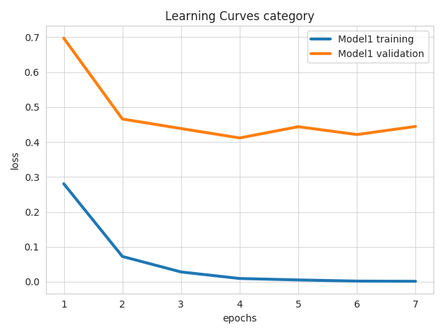
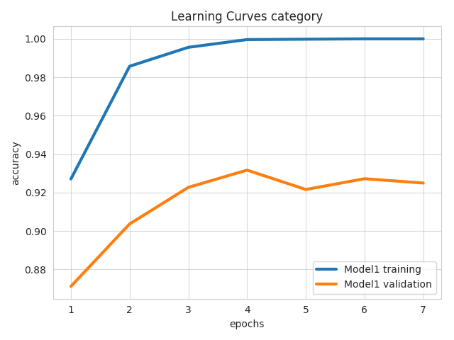
learning_curves
Parameters for this visualization:
output_directoryfile_formatoutput_feature_nametraining_statisticsmodel_names
For each model (in the aligned lists of training_statistics and model_names) and for each output feature and measure of the model, it produces a line plot showing how that measure changed over the course of the epochs of training on the training and validation sets. If output_feature_name is not specified, then all output features are plotted.
Example command:
ludwig visualize --visualization learning_curves \
  --output_feature_name Survived \
  --training_statistics results/titanic_Model1_0/training_statistics.json \
       results/titanic_Model2_0/training_statistics.json \
  --model_names Model1 Model2
Confusion Matrix
confusion_matrix
Parameters for this visualization:
ground_truth_metadataoutput_directoryfile_formatoutput_feature_nametest_statisticsmodel_namestop_n_classesnormalize
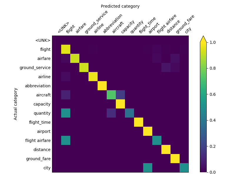
For each model (in the aligned lists of test_statistics and model_names) it produces a heatmap of the confusion matrix in the predictions for each field that has a confusion matrix in test_statistics.
The value of top_n_classes limits the heatmap to the n most frequent classes.
Example command:
ludwig visualize --visualization confusion_matrix \
  --ground_truth_metadata results/titanic_Model1_0/model/train_set_metadata.json \
  --test_statistics results/titanic_Model1_0/test_statistics.json \
  --top_n_classes 2
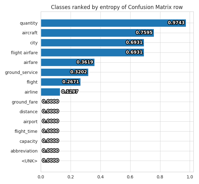
The second plot produced, is a barplot showing the entropy of each class, ranked from most entropic to least entropic.
Compare Performance
compare_performance
Parameters for this visualization:
output_directoryfile_formatoutput_feature_nametest_statisticsmodel_names
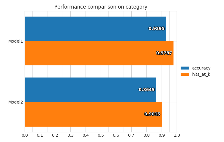
For each model (in the aligned lists of test_statistics and model_names) it produces bars in a bar plot, one for each overall metric available in the test_statistics file for the specified output_feature_name.
Example command:
ludwig visualize --visualization compare_performance \
  --output_feature_name Survived \
  --test_statistics results/titanic_Model1_0/test_statistics.json \
       results/titanic_Model2_0/test_statistics.json \
  --model_names Model1 Model2
compare_classifiers_performance_from_prob
Parameters for this visualization:
ground_truthsplit_fileground_truth_metadataoutput_directoryfile_formatoutput_feature_nameground_truth_splitprobabilitiesmodel_namestop_n_classeslabels_limit
output_feature_name needs to be a category.
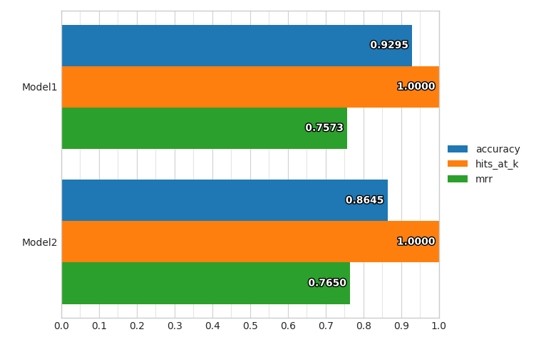
For each model (in the aligned lists of probabilities and model_names) it produces bars in a bar plot, one for each overall metric computed on the fly from the probabilities of predictions for the specified output_feature_name.
Example command:
ludwig visualize --visualization compare_classifiers_performance_from_prob \
  --ground_truth train.hdf5 \
  --output_feature_name Survived \
  --probabilities results/titanic_Model1_0/Survived_probabilities.csv \
        results/titanic_Model2_0/Survived_probabilities.csv \
  --model_names Model1 Model2
compare_classifiers_performance_from_pred
Parameters for this visualization:
ground_truthsplit_fileground_truth_metadataoutput_directoryfile_formatoutput_feature_nameground_truth_splitpredictionsmodel_nameslabels_limit
output_feature_name needs to be a category.
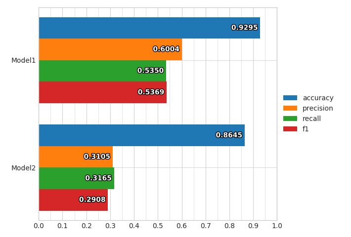
For each model (in the aligned lists of predictions and model_names) it produces bars in a bar plot, one for each overall metric computed on the fly from the predictions for the specified output_feature_name.
Example command:
ludwig visualize --visualization compare_classifiers_performance_from_pred \
  --ground_truth train.hdf5 \
  --ground_truth_metadata train.json \
  --output_feature_name Survived \
  --predictions results/titanic_Model1_0/Survived_predictions.csv \
        results/titanic_Model2_0/Survived_predictions.csv \
  --model_names Model1 Model2
compare_classifiers_performance_subset
Parameters for this visualization:
ground_truthsplit_fileground_truth_metadataoutput_directoryfile_formatoutput_feature_nameground_truth_splitprobabilitiesmodel_namestop_n_classeslabels_limitsubset
output_feature_name needs to be a category.
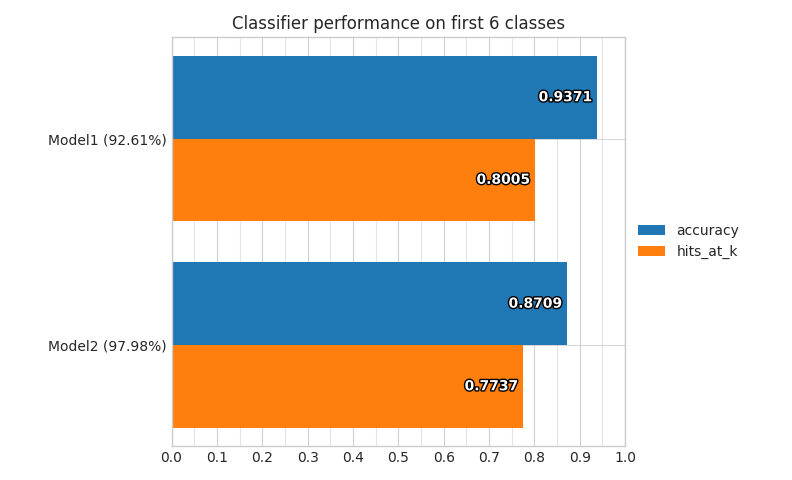
For each model (in the aligned lists of predictions and model_names) it produces bars in a bar plot, one for each overall metric computed on the fly from the probabilities predictions for the specified output_feature_name, considering only a subset of the full training set.
The way the subset is obtained is using the top_n_classes and subset parameters.
If the values of subset is ground_truth, then only datapoints where the ground truth class is within the top n most frequent ones will be considered as test set, and the percentage of datapoints that have been kept from the original set will be displayed.
Example command:
ludwig visualize --visualization compare_classifiers_performance_subset \
  --ground_truth train.hdf5 \
  --ground_truth_metadata train.json \
  --output_feature_name Survived \
  --probabilities results/titanic_Model1_0/Survived_probabilities.csv \
           results/titanic_Model2_0/Survived_probabilities.csv \
  --model_names Model1 Model2 \
  --top_n_classes 2 \
  --subset ground_truth
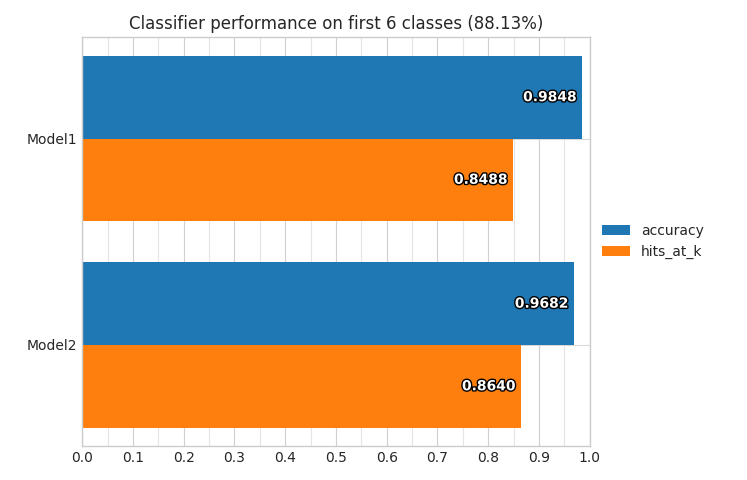
If the values of subset is predictions, then only datapoints where the the model predicts a class that is within the top n most frequent ones will be considered as test set, and the percentage of datapoints that have been kept from the original set will be displayed for each model.
compare_classifiers_performance_changing_k
Parameters for this visualization:
ground_truthsplit_fileground_truth_metadataoutput_directoryfile_formatoutput_feature_nameground_truth_splitprobabilitiesmodel_namestop_klabels_limit
output_feature_name needs to be a category.
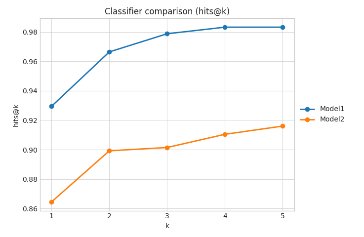
For each model (in the aligned lists of probabilities and model_names) it produces a line plot that shows the Hits@K measure (that counts a prediction as correct if the model produces it among the first k) while changing k from 1 to top_k for the specified output_feature_name.
Example command:
ludwig visualize --visualization compare_classifiers_performance_changing_k \
  --ground_truth train.hdf5 \
  --output_feature_name Survived \
  --probabilities results/titanic_Model1_0/Survived_probabilities.csv \
         results/titanic_Model2_0/Survived_probabilities.csv \
  --model_names Model1 Model2 \
  --top_k 5
compare_classifiers_multiclass_multimetric
Parameters for this visualization:
ground_truth_metadataoutput_directoryfile_formatoutput_feature_nametest_statisticsmodel_namestop_n_classes
output_feature_name needs to be a category.
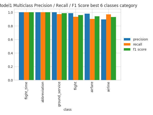
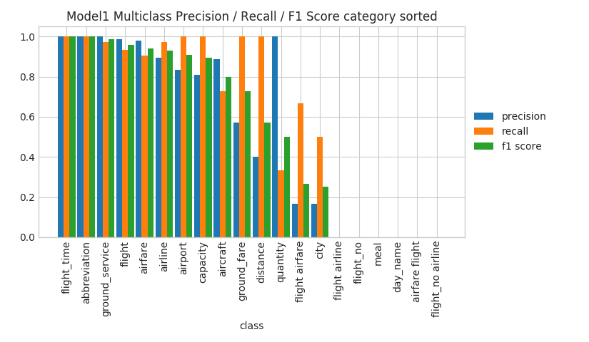
For each model (in the aligned lists of test_statistics and model_names) it produces four plots that show the precision, recall and F1 of the model on several classes for the specified output_feature_name.
The first one show the measures on the n most frequent classes.
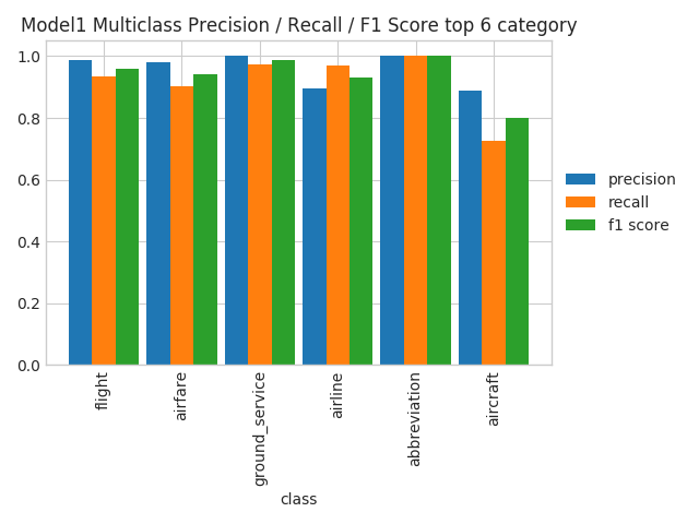
The second one shows the measures on the n classes where the model performs the best.
The third one shows the measures on the n classes where the model performs the worst.
The fourth one shows the measures on all the classes, sorted by their frequency. This could become unreadable in case the number of classes is really high.
Compare Classifier Predictions
compare_classifiers_predictions
Parameters for this visualization:
ground_truthsplit_fileground_truth_metadataoutput_directoryfile_formatoutput_feature_nameground_truth_splitpredictionsmodel_nameslabels_limit
output_feature_name needs to be a category and there must be two and only two models (in the aligned lists of predictions and model_names).
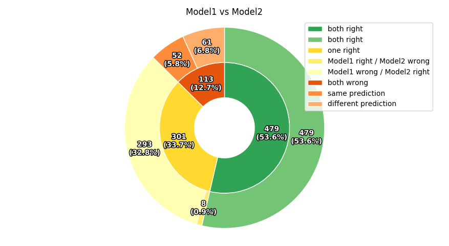
This visualization produces a pie chart comparing the predictions of the two models for the specified output_feature_name.
Example command:
ludwig visualize --visualization compare_classifiers_predictions \
  --ground_truth train.hdf5 \
  --output_feature_name Survived \
  --predictions results/titanic_Model1_0/Survived_predictions.csv \
          results/titanic_Model2_0/Survived_predictions.csv \
  --model_names Model1 Model2
compare_classifiers_predictions_distribution
Parameters for this visualization:
ground_truthsplit_fileground_truth_metadataoutput_directoryfile_formatoutput_feature_nameground_truth_splitpredictionsmodel_nameslabel_limits
output_feature_name needs to be a category.
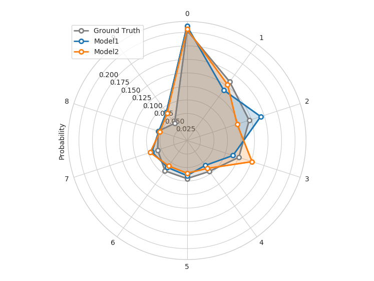
This visualization produces a radar plot comparing the distributions of predictions of the models for the first 10 classes of the specified output_feature_name.
Confidence Thresholding
confidence_thresholding
Parameters for this visualization:
ground_truthsplit_fileground_truth_metadataoutput_directoryfile_formatoutput_feature_nameground_truth_splitprobabilitiesmodel_nameslabels_limit
output_feature_name needs to be a category.
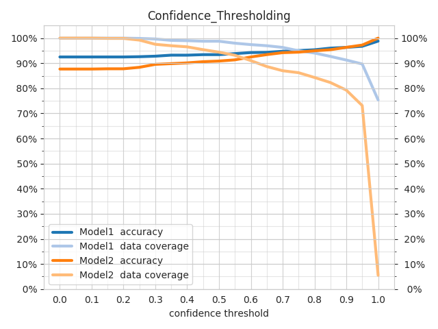
For each model (in the aligned lists of probabilities and model_names) it produces a pair of lines indicating the accuracy of the model and the data coverage while increasing a threshold (x axis) on the probabilities of predictions for the specified output_feature_name.
confidence_thresholding_data_vs_acc
Parameters for this visualization:
ground_truthsplit_fileground_truth_metadataoutput_directoryfile_formatoutput_feature_nameground_truth_splitprobabilitiesmodel_nameslabels_limit
output_feature_name needs to be a category.
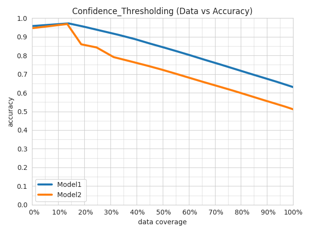
For each model (in the aligned lists of probabilities and model_names) it produces a line indicating the accuracy of the model and the data coverage while increasing a threshold on the probabilities of predictions for the specified output_feature_name.
The difference with confidence_thresholding is that it uses two axes instead of three, not visualizing the threshold and having coverage as x axis instead of the threshold.
confidence_thresholding_data_vs_acc_subset
Parameters for this visualization:
ground_truthsplit_fileground_truth_metadataoutput_directoryfile_formatoutput_feature_nameground_truth_splitprobabilitiesmodel_namestop_n_classeslabels_limitsubset
output_feature_name needs to be a category.
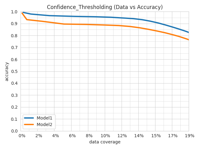
For each model (in the aligned lists of probabilities and model_names) it produces a line indicating the accuracy of the model and the data coverage while increasing a threshold on the probabilities of predictions for the specified output_feature_name, considering only a subset of the full training set.
The way the subset is obtained is using the top_n_classes and subset parameters..
The difference with confidence_thresholding is that it uses two axes instead of three, not visualizing the threshold and having coverage as x axis instead of the threshold.
If the values of subset is ground_truth, then only datapoints where the ground truth class is within the top n most frequent ones will be considered as test set, and the percentage of datapoints that have been kept from the original set will be displayed.
If the values of subset is predictions, then only datapoints where the the model predicts a class that is within the top n most frequent ones will be considered as test set, and the percentage of datapoints that have been kept from the original set will be displayed for each model.
confidence_thresholding_data_vs_acc_subset_per_class
Parameters for this visualization:
ground_truthsplit_fileground_truth_metadataoutput_directoryfile_formatoutput_feature_nameground_truth_splitprobabilitiesmodel_namestop_n_classeslabels_limitsubset
output_feature_name needs to be a category.
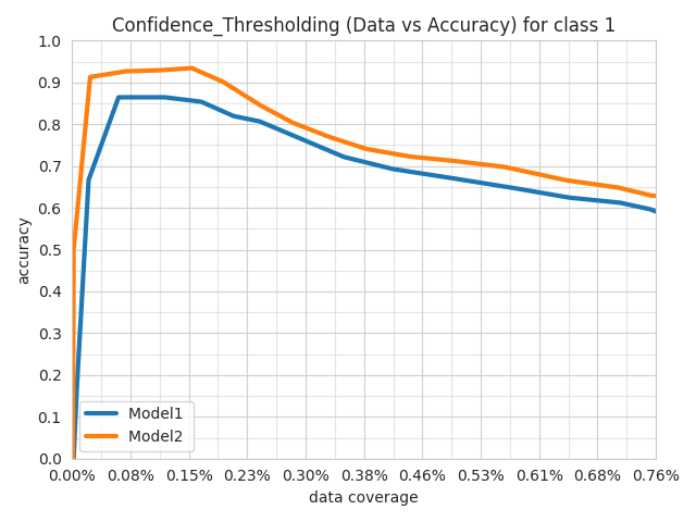
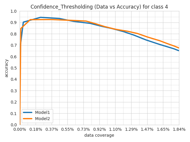
For each model (in the aligned lists of probabilities and model_names) it produces a line indicating the accuracy of the model and the data coverage while increasing a threshold on the probabilities of predictions for the specified output_feature_name, considering only a subset of the full training set.
The way the subset is obtained is using the top_n_classes and subset parameters..
The difference with confidence_thresholding is that it uses two axes instead of three, not visualizing the threshold and having coverage as x axis instead of the threshold.
If the values of subset is ground_truth, then only datapoints where the ground truth class is within the top n most frequent ones will be considered as test set, and the percentage of datapoints that have been kept from the original set will be displayed.
If the values of subset is predictions, then only datapoints where the the model predicts a class that is within the top n most frequent ones will be considered as test set, and the percentage of datapoints that have been kept from the original set will be displayed for each model.
The difference with confidence_thresholding_data_vs_acc_subset is that it produces one plot per class within the top_n_classes.
confidence_thresholding_2thresholds_2d
Parameters for this visualization:
ground_truthsplit_fileground_truth_metadataoutput_directoryfile_formatground_truth_splitthreshold_output_feature_namesprobabilitiesmodel_nameslabels_limit
threshold_output_feature_names need to be exactly two, either category or binary.
probabilities need to be exactly two, aligned with threshold_output_feature_names.
model_names has to be exactly one.
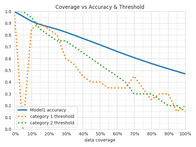
Three plots are produced.
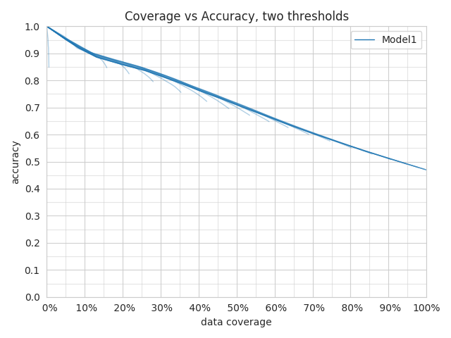
The first plot shows several semi transparent lines.
They summarize the 3d surfaces displayed by confidence_thresholding_2thresholds_3d that have thresholds on the confidence of the predictions of the two threshold_output_feature_names as x and y axes and either the data coverage percentage or the accuracy as z axis.
Each line represents a slice of the data coverage surface projected onto the accuracy surface.
The second plot shows the max of all the lines displayed in the first plot.
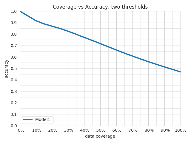
The third plot shows the max line and the values of the thresholds that obtained a specific data coverage vs accuracy pair of values.
confidence_thresholding_2thresholds_3d
Parameters for this visualization:
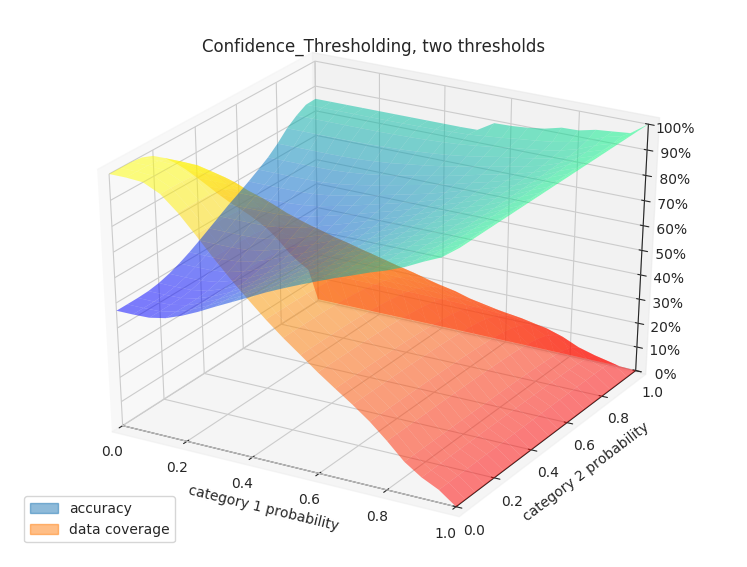
ground_truthsplit_fileground_truth_metadataoutput_directoryfile_formatground_truth_splitthreshold_output_feature_namesprobabilitieslabels_limit
threshold_output_feature_names need to be exactly two, either category or binary.
probabilities need to be exactly two, aligned with threshold_output_feature_names.
The plot shows the 3d surfaces displayed by confidence_thresholding_2thresholds_3d that have thresholds on the confidence of the predictions of the two threshold_output_feature_names as x and y axes and either the data coverage percentage or the accuracy as z axis.
Binary Threshold vs. Metric
binary_threshold_vs_metric
Parameters for this visualization:
ground_truthsplit_fileground_truth_metadataoutput_directoryfile_formatoutput_feature_nameground_truth_splitprobabilitiesmodel_namesmetricspositive_label
output_feature_name can be a category or binary feature.
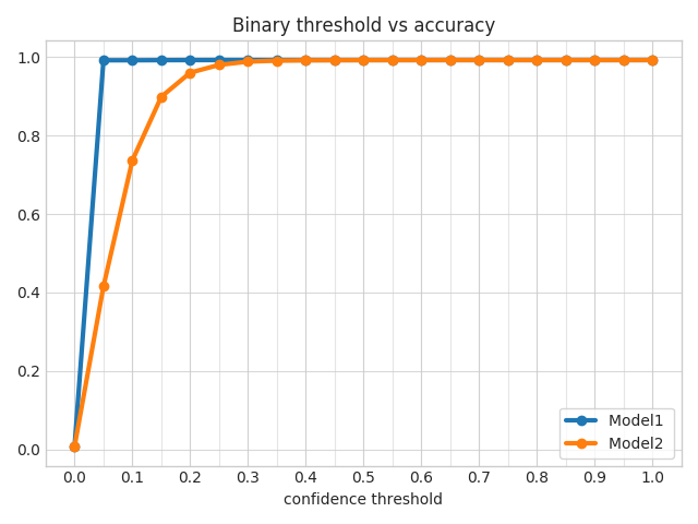
For each metric specified in metrics (options are f1, precision, recall, accuracy), this visualization produces a line chart plotting a threshold on the confidence of the model against the metric for the specified output_feature_name.
If output_feature_name is a category feature, positive_label indicates which is the class to be considered positive class and all the others will be considered negative.
It needs to be an integer, to figure out the association between classes and integers check the ground_truth_metadata JSON file.
ROC Curves
roc_curves
Parameters for this visualization:
ground_truthsplit_fileground_truth_metadataoutput_directoryfile_formatoutput_feature_nameground_truth_splitprobabilitiesmodel_namespositive_label
output_feature_name can be a category or binary feature.
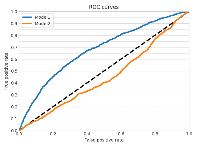
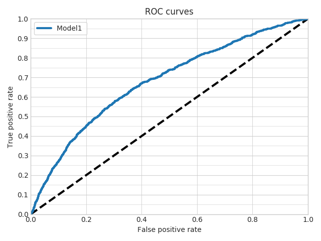
This visualization produces a line chart plotting the roc curves for the specified output_feature_name.
If output_feature_name is a category feature, positive_label indicates which is the class to be considered positive class and all the others will be considered negative.
It needs to be an integer, to figure out the association between classes and integers check the ground_truth_metadata JSON file.
roc_curves_from_test_statistics
Parameters for this visualization:
output_directoryfile_formatoutput_feature_nametest_statisticsmodel_names
output_feature_name needs to be binary feature.
This visualization produces a line chart plotting the roc curves for the specified output_feature_name.
Calibration Plot
calibration_1_vs_all
Parameters for this visualization:
ground_truthsplit_fileground_truth_metadataoutput_directoryfile_formatoutput_feature_nameground_truth_splitprobabilitiesmodel_namestop_n_classeslabels_limit
output_feature_name needs to be a category or binary.
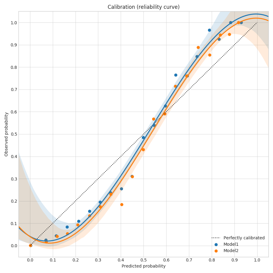
For each class or each of the n most frequent classes if top_n_classes is specified, it produces two plots computed on the fly from the probabilities of predictions for the specified output_feature_name.
The first plot is a calibration curve that shows the calibration of the predictions considering the current class to be the true one and all others to be a false one, drawing one line for each model (in the aligned lists of probabilities and model_names).
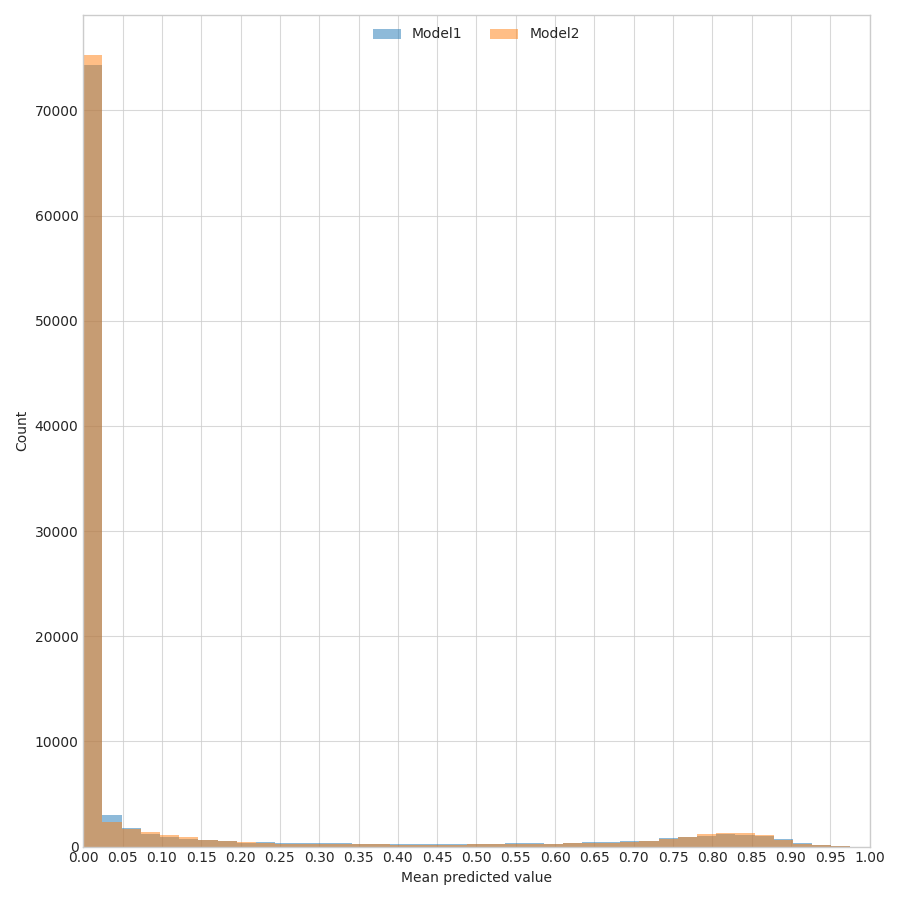
The second plot shows the distributions of the predictions considering the current class to be the true one and all others to be a false one, drawing the distribution for each model (in the aligned lists of probabilities and model_names).
calibration_multiclass
Parameters for this visualization:
ground_truthsplit_fileground_truth_metadataoutput_directoryfile_formatoutput_feature_nameground_truth_splitprobabilitiesmodel_nameslabels_limit
output_feature_name needs to be a category.
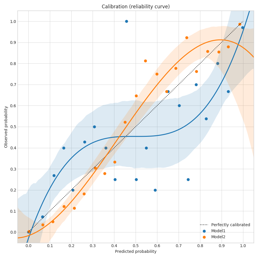
For each class, produces two plots computed on the fly from the probabilities of predictions for the specified output_feature_name.
The first plot is a calibration curve that shows the calibration of the predictions considering al classes, drawing one line for each model (in the aligned lists of probabilities and model_names).
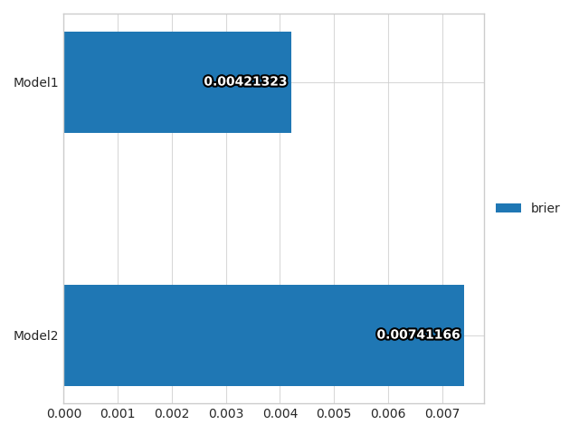
The second plot shows a bar plot of the brier score (that calculates how calibrated are the probabilities of the predictions of a model), drawing one bar for each model (in the aligned lists of probabilities and model_names).
Class Frequency vs. F1 score
frequency_vs_f1
Parameters for this visualization:
ground_truth_metadataoutput_directoryfile_formatoutput_feature_nametest_statisticsmodel_namestop_n_classes
output_feature_name needs to be a category.
For each model (in the aligned lists of test_statistics and model_names), produces two plots statistics of predictions for the specified output_feature_name.
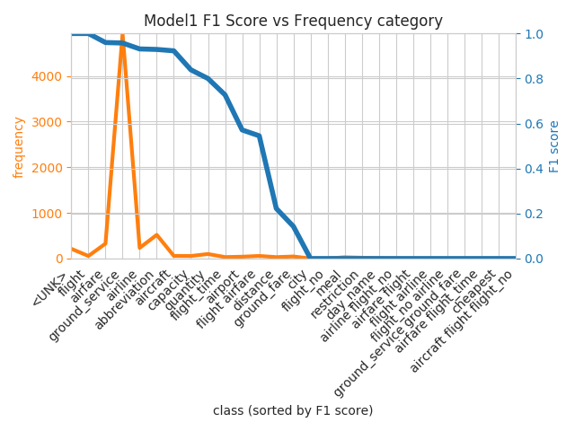
Generates plots for top_n_classes. The first plot is a line plot with one x axis representing the different classes and two vertical axes colored in orange and blue respectively.
The orange one is the frequency of the class and an orange line is plotted to show the trend.
The blue one is the F1 score for that class and a blue line is plotted to show the trend.
The classes on the x axis are sorted by f1 score.
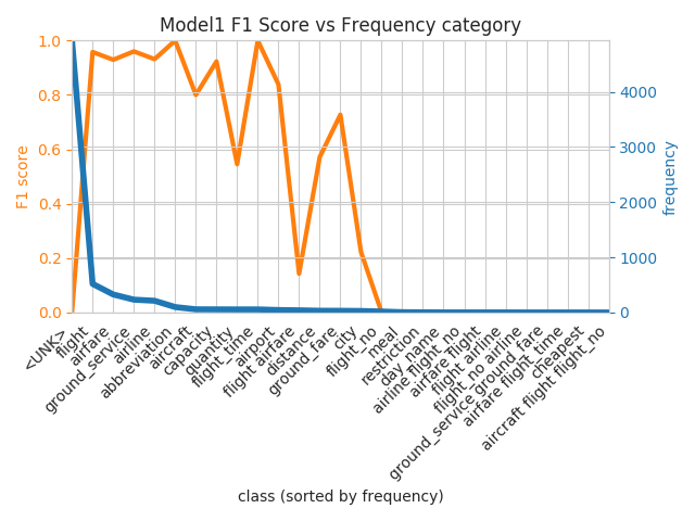
The second plot has the same structure of the first one, but the axes are flipped and the classes on the x axis are sorted by frequency.
Hyper-parameter optimization visualization
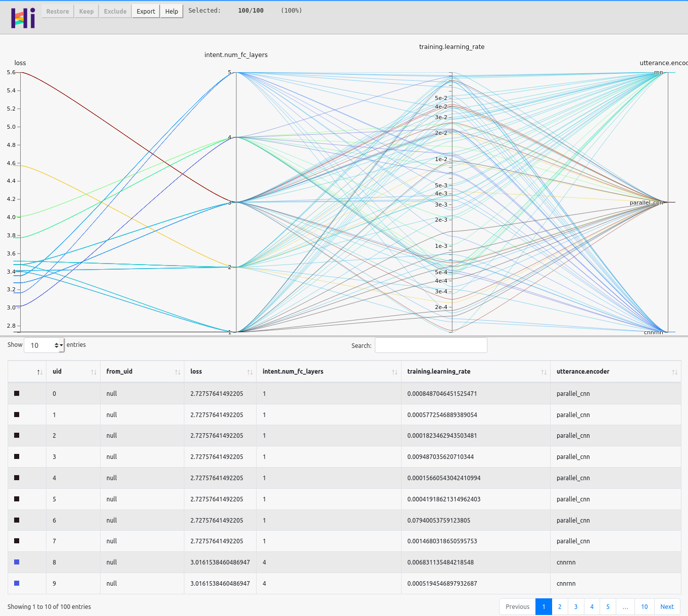
The examples of the hyper-parameter visualizations shown here are obtained by running a random search with 100 samples on the ATIS dataset used for classifying intents given user utterances.
hyperopt_report
Parameters for this visualization:
output_directoryfile_formathyperopt_stats_path
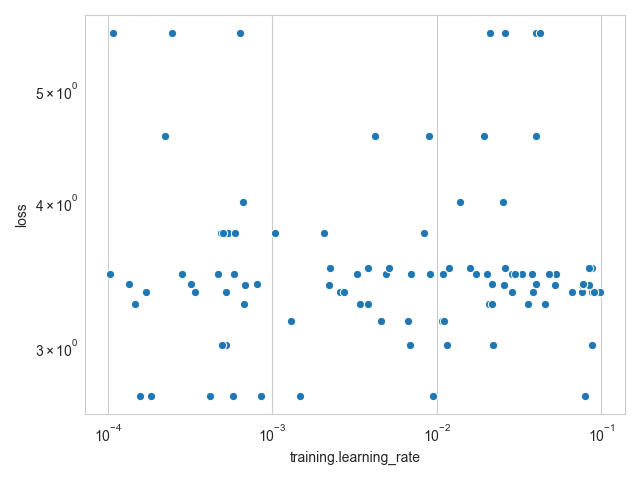
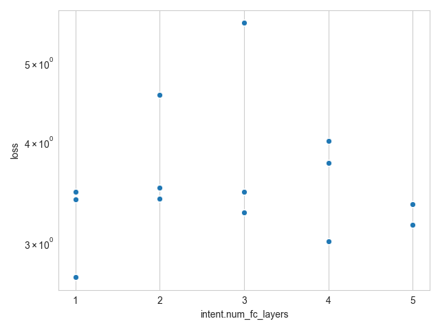
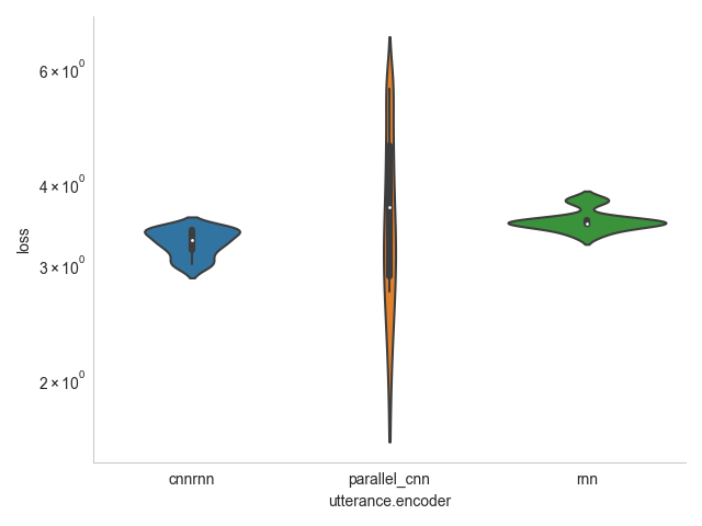
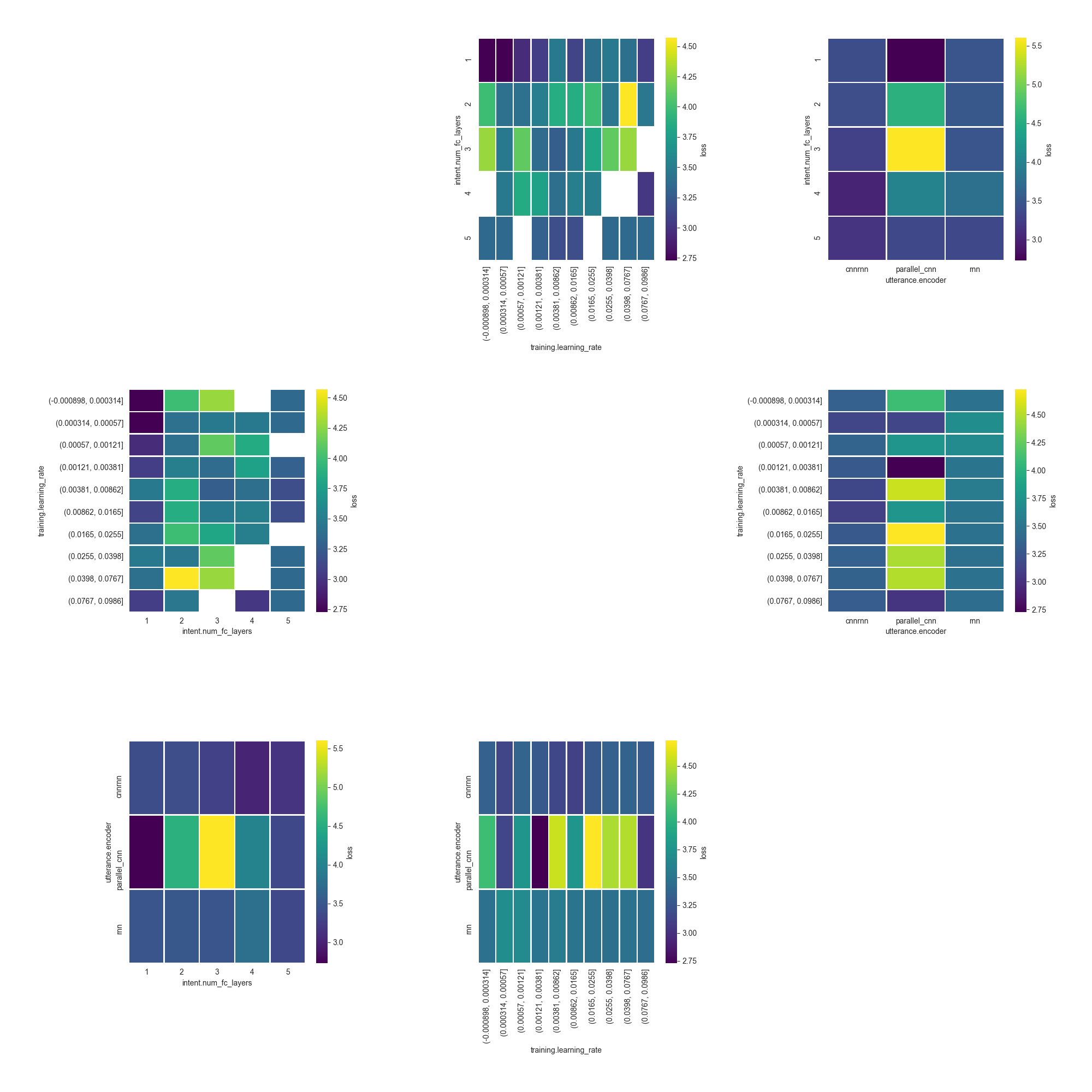
The visualization creates one plot for each hyper-parameter in the file at hyperopt_stats_path, plus an additional one containing a pair plot of hyper-parameters interactions.
Each plot will show the distribution of the parameters with respect to the metric to optimize.
For float and int parameters, a scatter plot is used, while for category parameters, a violin plot is used instead.
The pair plot shows a heatmap of how the values of pairs of hyper-parameters correlate with the metric to optimize.
hyperopt_hiplot
Parameters for this visualization:
output_directoryfile_formathyperopt_stats_path
The visualization creates an interactive HTML page visualizing all the results from the hyper-parameter optimization at once, using a parallel coordinate plot.
